
Shared from – Chapeau Noir Blog – Trends in Golf Apparel.
If you’ve ever wondered why your favorite player looks more like a NASCAR driver than he does a golfer, take a look at this interesting graphic, sent my way by Nick Jenkins. The graphic ballparks what players make to wear a company’s logo, citing no fewer than nine strategic placements.
Published in 2011 by Crescent Partners CurtComm, the numbers should still be relatively valid, but keep in mind that these numbers don’t represent every player across each of the tours cited — Joe Lunchpail who lives out of his car trying to Monday qualify for events isn’t raking in these numbers.
The content that accompanies the graphic in the original post notes the following interesting points regarding pricing:
- Estimates for the nine brand exposure options cross a broad spectrum of talent on the PGA, Champions, LPGA and Web.com (previously Nationwide) Tours.
- Numbers are based on the three-year average of deals negotiated by the Colvin Sports Network as well as their awareness of other golf endorsement arrangements that have taken place during that time period.
One other item I found of interest — Nike is a “clean company” — meaning that no other company’s branding can appear on Nike apparel. So if you are looking to sponsor a Nike man, you’ll be limited placing your logo on the bag (like Fuse Science does with Tiger Woods).
Interesting stuff. You can read the original post over on Crescent Partners CurtComm.
Related posts
Meet Darren Wright
on Thursday 12, NovemberShared from TrendyGolf Magazine 26 year old golfer Darren Wright currently sits at the...
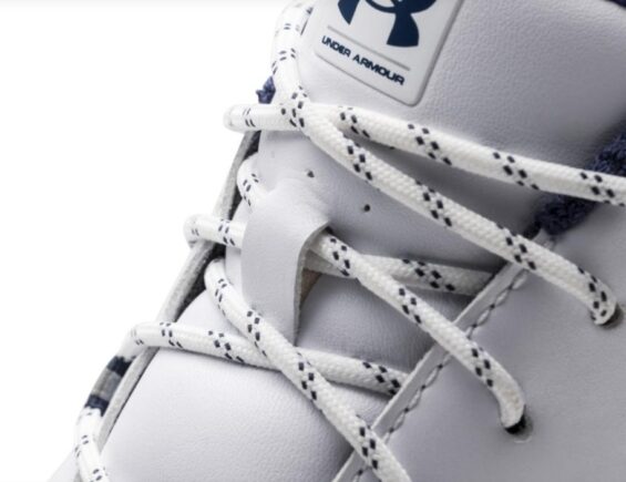
FULL ROUND COMFORT IN THE UA HOVR DRIVE
on Thursday 7, MarchUnder Armour Golf’s Newest Shoe Delivers Golfers Total Comfort and Powerful (shared from GolfPunk) Whether...
Puma unveils IGNITE Spikeless shoe
on Thursday 19, NovemberCobra has released its Ignite Spikeless shoe to sit alongside the recently-launched TitanTour Ignite....